Ultimate Guide for App Screenshot Design 2020
Designing your screenshots can be tricky, even if you have all your assets ready and have design experience. This post will give you a simple framework to create beautiful screenshots for the App Store without hiring a designer.
Choosing the right app screens for your screenshots
You created an app to solve a problem, so your screens should clearly showcase the solution. Meditation apps should show the meditation offering at work, calculator apps should show number crunching screens, and networking apps should show how to make connections.
Show app screens that help convey the value users will get. Some examples:
- Ecommerce app showing products the user can buy
- Education app showing classes the user can signup for
- Finance app showing the savings the user can get
- Travel app showing flashy hotels and their prices
- Video editing app that shows the editor at work
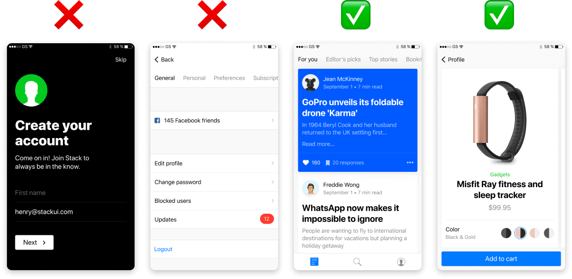
Avoid using screenshots that don't help explain your product. App onboarding screens, signup pages, settings: these typically don't help compound the value your app is giving. Focus instead on showing content!
App screenshot A/B testing platform Storemaven states that only 11.98% of users will scroll through your screenshots, so assume that most users will only see the first 3 screenshots you create.
✅ What app screens to include:
- The value they get from using your app
- Core feature(s) that help them get value
- How the user uses the core features
❌ What app screens to avoid:
- Splash screens with your logo
- Account creation screens
- Account/Settings pages (unless they are core to the product)
- Onboarding screens
The best layouts to use for your screenshots
Now that you’ve selected your screens, the next step is to choose the best layout to display them. Focus on making sure the layout helps the user understand and visualize your screens. Flashy screenshots might attract the user’s attention, but if your captions and screens are not easy to visualize they may instead hurt your installs.
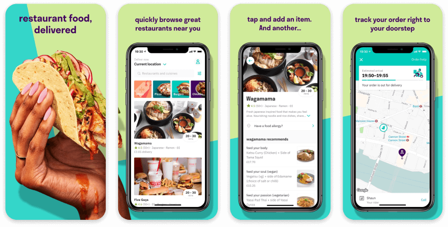
Deliveroo is a good example of simple app screenshots that go a long way. Their device layouts help showcase their screens so they are easy to see without having to tap on each one-by-one.
Their app IU is also very visual with a lot of photos of food. They use this to their advantage by letting the user see these images in their first 3 screenshots. This helps compound the value the user is getting (good food delivered).
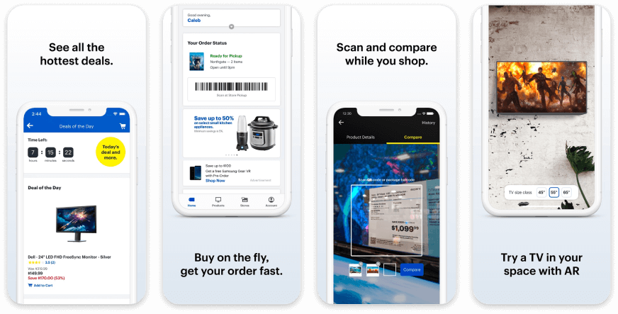
Best Buy chose a screenshot layout that helps emphasize parts of their app by orienting the devices at the top and bottom of their screenshots. This helps them focus on the app screen content while avoiding parts of the app that are not relevant or contain negative space.
.png)
This example shows the different layouts you can choose. This property rental app has images of beautiful properties in each screen, so the goal is to bring more focus on them. The brighter screenshots help with this, bringing more attention to the property image.
✅ What layouts to use:
- Layouts that help visualize the screen value/feature (eg: content offering, editor, feature, etc)
- Layouts that get rid of “negative space” (eg: app navigation, status bar, important metadata, etc)
❌ What layouts to avoid:
- Showing the full screen when you only need to show a part of it
- Too many different layouts as it can detract from screenshot scannability (eg: stick 1-3 layouts)
Screenshot backgrounds you should use
Your background needs to help emphasize your screens, not detract from them. Don’t overthink them; the real value your screenshots provide to users are legibility and scannability. Your backgrounds should help accomplish this.
.png)
Image backgrounds can be a great way to help emphasize the core value of your app but be careful. The example above shows a few backgrounds that actually hurt readability as they distract from their screens & captions and don’t provide context to what the app does. The backgrounds on the right both help compound the app value (up and to the right graph for an investing app) and help bring focus to the screen and caption (color gradient).
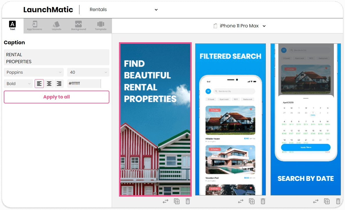
A good method of using an image background is to create an introduction screenshot that explains the core functionality of your app. This can be a great way to help the user visualize what your app does right away.
✅ What screenshot backgrounds to use:
- A color or image that helps make your app screen/device pop out (eg: dark background for a light colored app screen)
- Background color that makes your text captions very easy to read (eg: black bg for white captions)
- An image that helps showcase your app’s core value/feature (eg: food for a delivery app)
- Color gradients that aren’t too distracting (eg: see Best Buy’s screenshots above)
❌ What screenshot backgrounds to avoid:
- Messy image backgrounds with a lot of content
- Background images that aren’t relevant to your offering or brand
- Color schemes that are distracting (eg: bright green background with dark app screen)
Writing your screenshot text captions
Your text captions should be written so that they help bring more clarity to the screen they are paired with. If you are focusing on a feature, make sure you write a caption that explains the value or functionality of the feature.
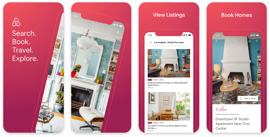
Airbnb has crafted their text captions perfectly. They are short and readable, they explain the app screen, they have great contrast against the screenshot background color, and they even contain high value keyword phrases that can help you convert better when users search for them.
Text caption size is important, too. The Apple App Store allows for 3 portrait or 1 landscape screenshot to show in Apple Search. These are downsized to fit within a user’s device, so your screenshots and text captions will look much smaller. Make sure your captions are readable from Apple Search! Having small text that is only legible when a user taps into your product page means you are forcing the user to bypass the Install button from Apple Search to learn more information.
For Google Play your screenshots will only show on your page listing (unless for a direct brand name search). Even these screenshots are small, so any tiny text may not be readable until a user taps on your screenshot.
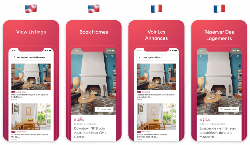
Short captions also help with translation, as some languages have more characters per word (I’m looking at you, German language). Short captions will help with the translation process as there will be a smaller chance for translation problems and formatting issues.
Designing your text captions is the last step. Pick a font that is legible (no cursive!) and a color that pops against your background color. If you need to add more text, that’s completely fine! The best format would be to have 2 text fields: a title and subtitle. The title is large and highly readable, while the subtitle is smaller and provides more context for the user if they want to learn more.
✅ How to write your text captions:
- Your text caption should explain the screen it’s paired with
- Use keywords that are relevant to your app
- Make sure the font color makes it legible against your background color
- Keep your captions small as it can help with scannability and translation
- Use a title (large) and subtitle (small) format if you need to it to explain your screen
❌ How not to write your captions:
- Don’t provide context to your screen
- A wall of text
- Too small for the user to read without tapping on it
- Unreadable due to the background image or color
Use LaunchMatic's Premade Screenshot Templates
We want to make app screenshot design easy, and there's no easier way to generate app screenshots for iOS and Android than using a premade template. Our templates work for all platforms and device types and give you complete design control to change text captions, fonts, background colors and images, device color and device layout. Here are some example of existing templates:

All you need to do is upload your app screenshots for the devices you need and then plug them into the template you want. You can get App Store ready screenshots within 60 seconds.
Sign up for LaunchMatic and create your own screenshots, now!


